
As part of FIDO contents, we’re gathering here some women designers to talk about some of their works. The Digging into design section aims to focus on the method and the strategy to approach a design project, presenting specifically the ideas that stand behind it and the step-by-step.
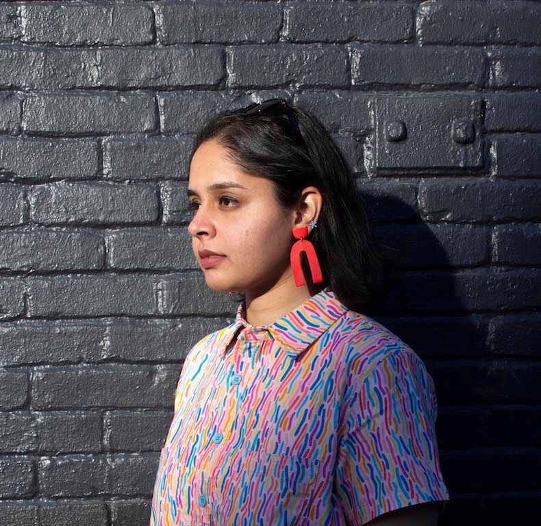
Shivani Parasnis is an Indian typographer and graphic designer, originally from Mumbai and currently based in the US, in Baltimore, Maryland. This is a good story because, it’s only in 2018 that she decided to give a pretty big switch to her career as she used to be a biotechnologist before that. And this is especially surprising considering the standard of quality and the kind of clients she’s been working for, alongside her full time job at Spotify. As senior designer, she works on brand identity, campaigns, and a lot of music marketing projects, “with a beautiful team of 16 designers so it’s like a small studio inside Spotify.”
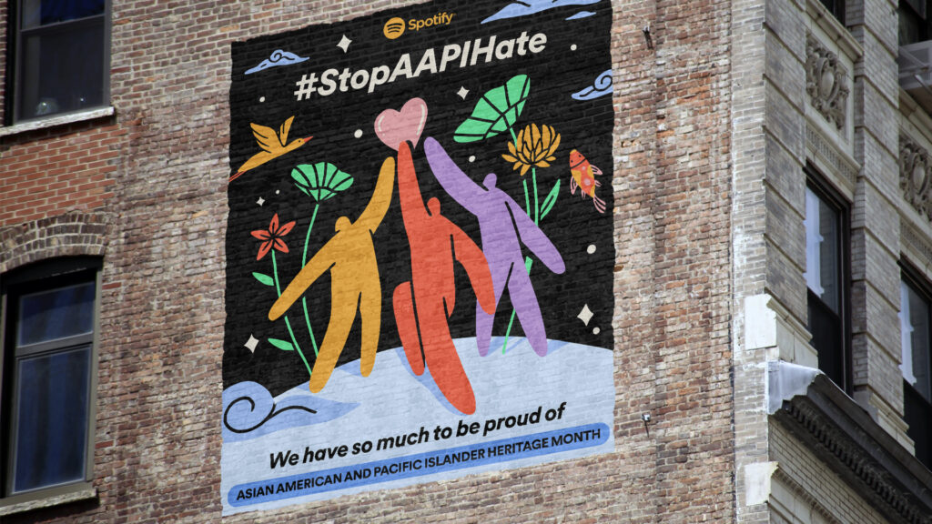
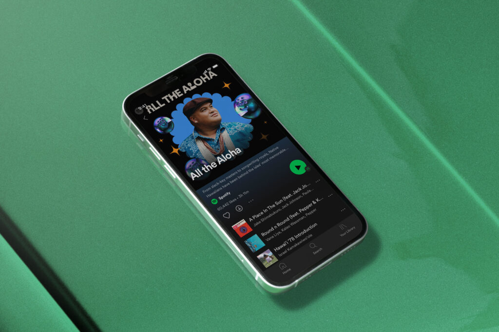
In this new chapter of Digging into design we’ll talk about the 2021 AAPI Heritage Month campaign by Spotify, on which Shivani worked as one of the two head designers of the project alongside her colleague Josephine Tansara. Let’s start from the very beginning and have a look at this yearly recurring feature of Spotify. Every single year Spotify celebrates the AAPIHM, which is the Asians Americans Pacific Island Heritage Month. Throughout the whole month they celebrate artists and talents inside the music industry but 2021 was a little different, Shivani says, because of the high number of crimes happening against Asians, specifically in the US but also worldwide. “We knew that we had to approach the campaign with a slightly different idea this time, we wanted to stand in solidarity with all of the artists that were probably facing the same issues so last year’s campaign had a more serious tone than what we had done earlier” said the designer. “Through the campaign we knew that we wanted to elevate a lot of Asian voices so the campaign was not just centered around artists in the industry but we also wanted to work with a lot of AAPI illustrators, a lot of AAPI businesses, and sort of bring that to the forefront as well,” she continued.
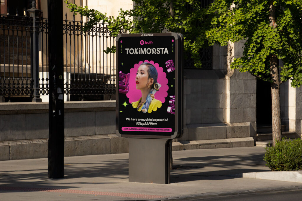
The 2021 AAPI Heritage Month featured many different aspects, indeed, laying on many different levels. The campaign went under the tagline “We have so much to be proud of” and the official hashtag chosen was #stopAAPIhate because, not only the design team, but everyone at Spotify, wanted the message to be very clear. The core idea is very simple and complex at the same time, made of different elements:
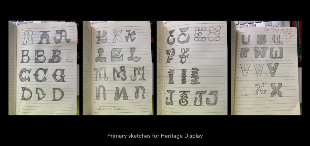
So, once they picked the right brief, they all got to work. First of all, hands on the typography. The company has a primal typeface called Spotify Circular which is used in general all across the campaign, but the team really felt the need to create a secondary typeface “which would do justice to all the different scripts and languages that we have in Asia” adds the designer. The team had one month and a half to work on everything, they started to work on the project mid March and the AAPIHM campaign was launched on the 1st of May last year. And as Shivani explains, they decided to go with a secondary typeface around a month before launch: “one month is not enough to make a typeface, we tried to approach an external type designer but it wasn’t the best option. I did a thesis project in my master’s degree in which I designed four typefaces over a year, so I can see that doing it in three weeks definitely is not enough.” Since Shivani had some background in type design from the school and she knew her way around and how to use the software, they made it happen. And as usually happens when you’re looking at things from the inside, the designer felt comfortable enough to show us that little imperfections in the project that we definitely can’t see from outside: “In that moment, to create something that adds so much meaning to what we were already doing, was more important than having something perfect.” This secondary typeface, called Heritage Display, is not used very often, maybe for a couple of letters per word, like a magic ingredient that makes great a good recipe.
So the month-long feature was a celebration but they also looked for a serious tone to underline the message they were putting out so last year’s campaign presented a black background for all of the visuals “which indicates that we try to create a very serious undertone to it but at the same time the colors on top of it are very playful” explains Shivani. The campaign included also the collaboration with a 3D partner, Hornet studio, who helped to come up with the 3D elements at the core of the project:
Besides all the different aspects and elements mentioned till now, the whole campaign project included merchandise production in collaboration with two AAPI brands, Alaya Tea and Baisun Candle, a mural drawn in Chinatown, New York, and a 30-seconds animation video to launch a new single by Audrey Nuna. And all this would not have been possible without a great team:
And that’s all for this chapter. We thank Shivani very much for the beautiful project and all the details she shared with us about Spotify’s AAPI Heritage Month campaign. See you in the next episode of Digging into Design with another special guest.
*** All the images are property of ©ShivaniParasnis, you’ll need her explicit permission to reproduce them 🙂
FULL CREDITS FOR SPOTIFY 2021 AAPIHM:
Principal Designers: Shivani Parasnis + Josephine Tansara
Creative Direction: Edward Yeung, Rajeev Basu
3D elements & animation: Hornet Studios
Mural design: Jocelyn Tsaih
Spotify Singles visualiser design & animation: BUCK
Production: Karen Chang + Ava Abdoulah + Kathy Cho
Extended team: SPACE resource group, ALP Teams at Spotify


