As part of FIDO contents, we’re gathering here some women designers to talk about some of their works. The Digging into design section aims to focus on the method and the strategy to approach a design project, presenting specifically the ideas that stand behind it and the step-by-step.
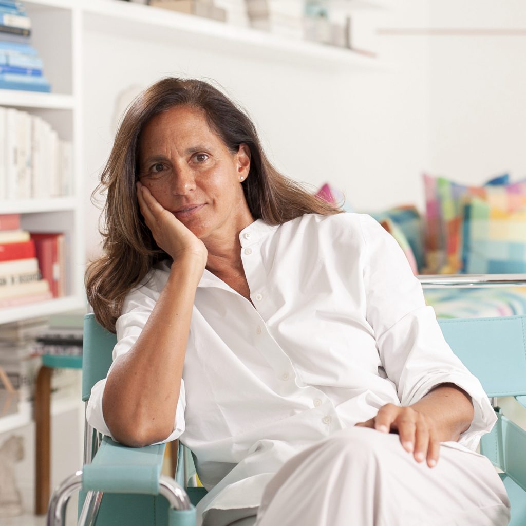
Two months after the outbreak of the war, we had the chance to reach out to Anna Kulachek, a brilliant designer and art director originally from Donetsk, Ukraine, who works and lives in New York. For the last eight years, till past February 24th, she has been working on the Strelka Institute’s visual identity, a non-profit international educational project located in Moscow. Strelka Institute for Media, Architecture, and Design has decided to stop all its projects and activities after the Russian invasion of Ukrainian territories, and consequently Anna’s collaboration is also paused right now. It goes without saying that this new chapter of Digging into design is especially meaningful considering the current social context and we’re extremely thankful to Anna for giving us the chance to tell the beautiful story behind her amazing relationship with this pioneering Russian cultural institution.
But before jumping to the subject of our new case study, we want to introduce properly Anna and her practice and nothing’s better than doing it through her own words:

As we’ve just heard, Anna initially started her collaboration with the Strelka Institute as a freelancer. She then joined the team as an in-house art director eight years ago, OK-RM studio was the creative director at that time, and after a couple of years she started her work as creative director herself. It’s quite hard to define in a few words the Strelka Institute, and if you google it, the resulting pages describe it as “a non-profit organization aimed at generating knowledge, producing new ideas and making them come true;” and also “The Institute promotes positive changes and creates new ideas through its educational activities;” and again “The Strelka Institute proposes a different way of looking at architecture: not only for the general improvement of design, but with the intention of introducing research as the most essential basis of architectural education.” So it’s fully understandable the discontent of the designer in front of the recent situation, and the following decision of pausing all the operations at the Institute, not only for her work but, mainly, for the fundamental role the Strelka, and culture in general, plays within the social fabric.

Despite the uncertain moment, she’s very happy to talk about her work there and share her own experience.
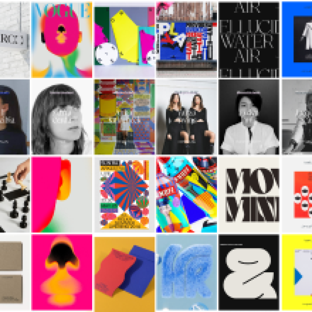
The very first thing she told us about her work at the Strelka was how lucky she felt to have the chance to do whatever she wanted and to experiment with complete freedom. When she started, there was so much work to do that she didn’t know how to manage it, but then she figured it out along with the rest of the team which she values greatly as a fundamental part of her job.

Everyone asks Anna Kulachek how she managed to turn her style made of basic shapes and bold primary colors into her trademark, a system instantly recognizable and belonging to her, and we’re no exception. We wanted to discover more about the recipe she follows to create a new piece and how she got there, and it turned out that, in a way, her inspiration finds its source in her Ukrainian roots:

While she usually doesn’t feel very involved in looking for the next and cutting-edge typography, colors on the contrary have the starring role in all she has done at Strelka.
She especially uses bright and bold colors that she doesn’t identify as part of an unwritten rule but rather a gut feeling that once again takes us back to her education in her hometown:

To keep on using a culinary metaphor, the magic recipe of brilliant and vibrant Strelka visual identity doesn’t come only from a powerful use of graphic design, but also from the great content the institute was always offering her to work on, and she hasn’t any problem to admit that “the packaging is always the continuation of the content.”
And it’s not surprising that this awesome result comes from a well motivated designer who is undoubtedly much more inspired to do an exceptional job when can work at her own conditions:
“For me it’s really important making design for something I believe in,” Anna added, “so I believed in Strelka and I believed in my team, as my boss believed in me so much to give me complete freedom. It was a dream job. I did what I wanted, in a great space with great content and with great people around.”

So thanks to Anna for sharing her work with us, it’s been a really stimulating conversation under many different aspects. We also wanna thank her for giving us the chance to express our solidarity with Ukraine on this specific occasion. We wanna see democracy being restored, art and culture centers reopened, and we wanna be joyful because peace has finally come. We wish Anna to be able to get back at work very soon and long live the Strelka Institute. See you in the next episode.
*** All the images are property of ©AnnaKulachek, you’ll need her explicit permission to reproduce them 🙂


